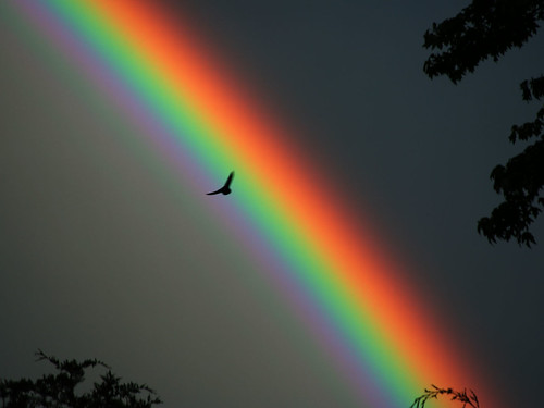
I was struck by something that was said last Sunday, questioning the use of spectrum imagery for faith and doubt. The imagery somehow implies that the two fall on opposite ends of some kind of Likert scale (e.g., 5=very good, 1=very bad) rather than the complex interaction and co-existence that is perhaps more common to most people's experience.
It reminds me of a similar pitfall in the use of spectrum imagery for autism, as if we could line people up "on the spectrum" in order of high-functioning to low-functioning, long wavelength to short wavelength, (very good to very bad?) Ummm. Not particularly helpful, to state it mildly.
Some challenges are surely more profound and disturbing than others. There have been some sobering stories echoing through the blogosphere lately. The perfect metaphor, both for autism and for faith, would capture that. Ultraviolet rays can cause skin cancer... look right into the sun too long and you'll burn out your retinas...
On the other hand, which color is the more beautiful, red or violet or something in between? What's the 5, what's the 1, and to what extent must it matter so much? Which person is less a valued and beloved child of God, the one in a place of confident faith or the one eaten to shreds by doubt? The "low-functioning" or "high-functioning" autist?
I think the beauty of the rainbow inherent in the spectrum imagery has a lot going for it, not least the symbolism of the rainbow in the book of Genesis:
And God said, "This is the sign of the covenant which I make between me and you and every living creature that is with you, for all future generations: I set my bow in the cloud, and it shall be a sign of the covenant between me and the earth." Genesis 9:12-13


6 comments:
This is beautiful in so many ways. Thanks.
Wow--this is deep and thought-provoking. And true.
Yes, agreeing with the first two comments, and, philosophical, if I may say.
Well worth thought, but I would not relish a storm over the term 'spectrum' in order to see the next 'rainbow' term.
I'm home. Unpacked. Tired. Oh, darn! This is comments not email!
'Night. Barbara
Now there's a more fitting symbol for us than the puzzle piece--a rainbow! Remember the magic of the old man in Pollyanna with his prisms explaining the spectrum to the kids? Also reminds me of the book I read to my twins, "I Love you the Purplest." Who can say which is more beautiful purple or yellow? Beauty is in the eye of the beholder. Thank you.
Andrea - oh, I'd forgotten all about the prism scene in Pollyanna! Lovely book connections, thank you. As for using rainbow as logo, I suppose we might run into some confusion with other causes that have already laid claim to the rainbow imagery, but I do like what they've done with it in the header over at http://autism.change.org/.
Beautiful. Love this post.
Post a Comment